PEAK Fitness Denver
PREFACE: Brand identity & strategy, art direction on website
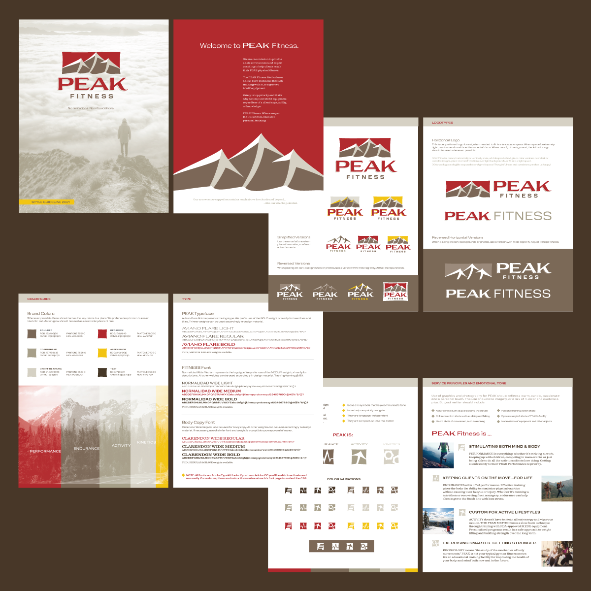
Chapter 1: Company naming, brand logo, icons, style guidebook, business card, email signature, letterhead, notecard & envelope design
Chapter 2: Door decal, wall graphic & QR code door static
FOREWORD: Kelly Erdman is a vivacious personal trainer who owns a personal fitness space in Denver. She has specialized equipment, meant specifically for people with injuries. She’s here to help people return to what they love to do, and educate themselves how to fix the hurt.
SETTING: Kelly has a vivacious personality with signature red eyeglasses. The use of red in her brand just made sense
Being in Colorado, I named her company PEAK to go along with the acronym Performance, Activity, Endurance, Kinetics
When a person is injured, there’s only one way to go: UP. The ice caps in the peaks are arrows
To this day, Kelly is my largest client and I plan to do so much more with her brand story. We worked with web designer Jaclyn on her site (dmemarketingcolorado.com) and did plenty of fun print stuff too. I was honored to name her company (as an acronym too: Performance, Activity, Endurance, Kinetics) and build the rest of her brand. I truly thank her for putting her trust in me. She even commissioned me to paint a canvas for her well-decorated husband in the world of NASA. Thank you so much, Queen of the Mountain Peaks!


